Photo by American Public Power Association on Unsplash.
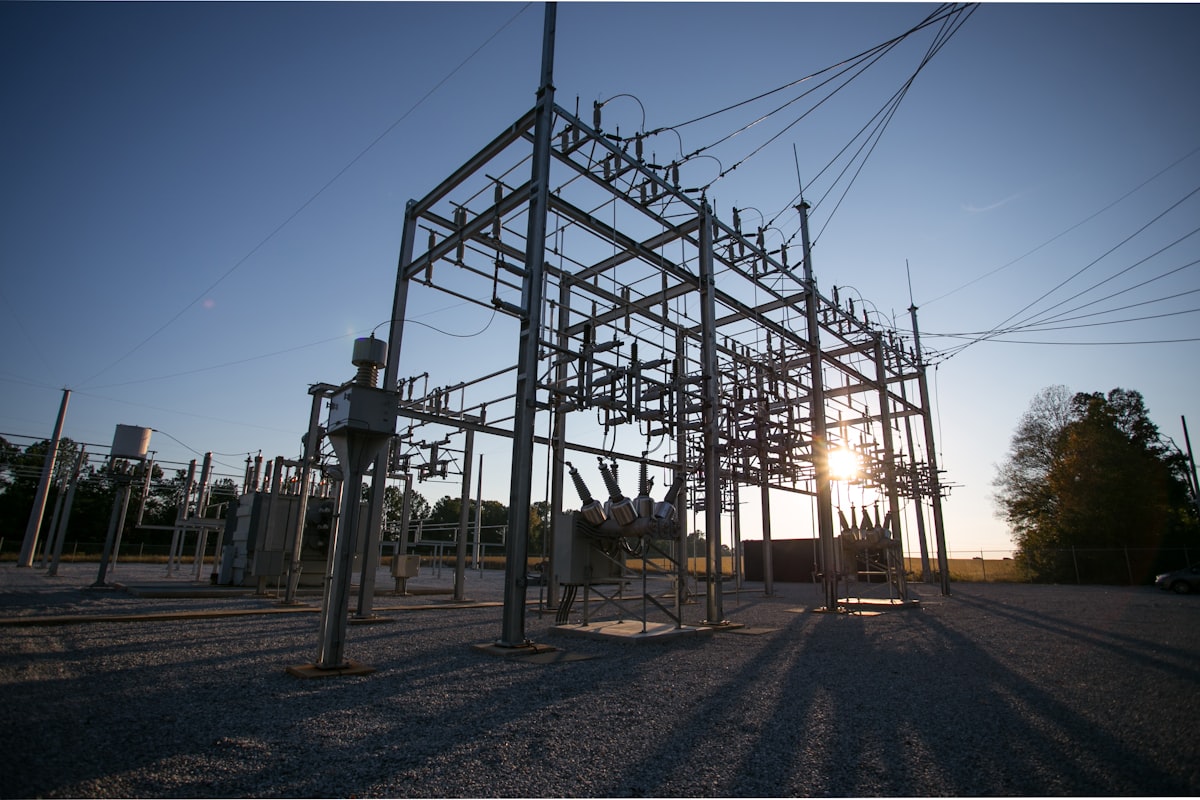
A grid operator doesn't get graded on one forecast. Distribution operators handle SCADA feeds, smart meter telemetry, weather data, and demand-response signals continuously, and every one of those streams feeds a decision: how much reserve to hold, which feeder to check first, whether tomorrow's cold snap needs a different generation commitment than today's model assumed. Our energy and utilities industry page covers that operational picture end to end. This article goes deeper on two problems inside it: forecasting demand honestly enough to act on, and catching the anomalies that threshold alarms miss until they become an outage.
The forecasting problem at grid scale
Demand at grid scale doesn't move like demand in a single building. A commercial building's load curve is fairly predictable: occupancy, weather, and a handful of large mechanical loads account for most of the variance. A grid operator is forecasting across thousands of those curves at once, plus industrial loads that shift with production schedules, plus a generation mix that increasingly includes wind and solar output swinging with the weather rather than following it a few hours later the way heating and cooling load does.
Peak timing compounds the problem. A distribution network doesn't fail on average demand; it fails at the peak, and the peak doesn't arrive at the same hour twice in a row once EV charging, heat pumps, and behind-the-meter solar are all pulling the load curve in different directions. A forecast that is right on average and wrong at the peak is the forecast that causes the problem it was meant to prevent: under-provisioned reserve on the one afternoon it actually mattered.
Confidence-bounded load forecasts
Most forecasting tools still hand back a single number: tomorrow's peak load is 42 MW. That number is comfortable to read and often wrong in a specific way, because it hides how confident the model actually is. A forecast built from ten years of stable weather patterns and a forecast built from three weeks of data on a newly commissioned feeder can produce the same point estimate with very different reliability, and a dispatcher acting on either number has no way to tell them apart.
Confidence-bounded forecasting attaches an explicit range to every prediction instead of a bare headline figure. A forecast that comes back as “42 MW, plus or minus 6 MW” tells a procurement team something a point estimate alone never could: how much reserve to actually hold against this forecast, on this day, given how much the model actually knows. Widen that band during a cold snap the model hasn't seen much of, narrow it on a stable summer weekday, and the dispatch decision starts to reflect real uncertainty instead of manufactured precision. We cover the forecasting mechanics in more depth, including the multi-horizon predictions and pattern matching underneath the confidence bounds, in our guide to sensor forecasting. For a grid operator, the short version is that an honest range beats a confident guess whenever reserve capacity or procurement costs real money.
Anomalies in energy data
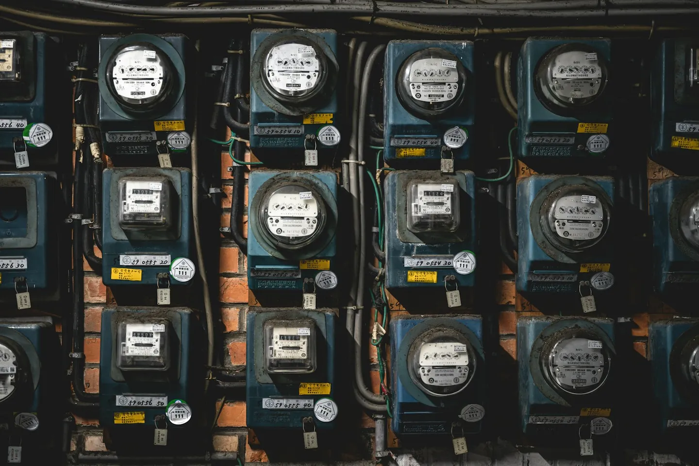
Not every irregularity in a meter feed is a fault, and not every fault looks like an alarm. A meter that has drifted out of calibration reads consistently low or high for months before anyone notices, because the reading stays stable, just consistently wrong. A theft or loss signature on a distribution feeder often shows up as a small, persistent gap between what was generated and what was billed, not a spike a threshold rule would catch. Equipment drift on a transformer or capacitor bank behaves the same way it does in a building's mechanical plant: a slow directional creep that never crosses a static limit, because static limits were never built to catch a trend.
Catching these means looking at more than one signal at once. A meter reading on its own can't tell you whether a discrepancy is a calibration fault, a billing error, or a loss on the line. The same reading cross-checked against feeder load, weather-adjusted expected demand, and the pattern on neighboring meters usually can. That is the same cross-signal approach that flags a drifting valve in a commercial building before it costs real money. On a grid the stakes are unbilled load, non-payment, and slow equipment failure rather than a comfort complaint, but separating a genuine anomaly from ordinary variance is the same underlying problem either way.
Live grid carbon intensity
The Nordic grid mix is not a fixed number, whatever an annual emissions factor implies. Sweden runs on a hydro-and-nuclear base that barely moves hour to hour, but the wind share on top of it swings hard with the weather. Norway's mix is overwhelmingly hydro, but its exports to neighboring price areas shift with reservoir levels and interconnector flows, which changes what a marginal megawatt-hour actually displaces. Finland's mix has been shifting too, with more wind and nuclear capacity changing the picture from one year to the next. An operator or large consumer using a flat annual carbon factor across all of that is working with a number that describes the year reasonably well and almost no individual hour in it.
That gap matters for demand-response and procurement decisions, not just for annual reporting. Shifting a flexible load two hours earlier or later changes its real emissions impact by a meaningful margin when the marginal generation mix moves this much, and a flat factor has nothing to say about which two hours are the right ones. Reading a live grid carbon intensity signal alongside meter data and demand forecasts, the same way weather and demand-response signals already feed into the forecast, gives that scheduling decision something to work from besides an annual average: what the grid is actually running on right now.
One decision layer across every asset
A forecasting dashboard, a meter-anomaly report, and a carbon-intensity feed sitting in three separate tools still leave a dispatcher doing the correlation by hand, at exactly the moment they have the least time to do it. The dashboard is the question. The queue is the answer.
FrostLogic Explore reads SCADA, smart meter, weather, and demand-response feeds the same way it reads a building's sensors. Write access starts off; you grant it one scope at a time. It reconciles what forecasting, anomaly detection, and the live carbon signal each turn up into one ranked list. A substation trending toward a threshold breach under a forecast cold snap, a feeder showing a loss signature, a load worth shifting for cost and carbon reasons together: it all lands in the same queue, ranked by what it costs to ignore, instead of three separate systems that need a person to connect them by hand. For an operator running hundreds of forecasts and thousands of meters a day, that consolidation is the part that actually saves time, not one more chart to check.
FAQ
What does confidence-bounded forecasting actually mean? Every forecast comes with an explicit range attached, not just a single number. Instead of 42 MW, the output is 42 MW, plus or minus 6 MW, so dispatch and procurement decisions can be sized to how much the model actually knows rather than a false sense of precision.
Does this replace our SCADA or EMS? No. Explore reads SCADA, meter, and telemetry feeds and adds forecasting, anomaly detection, and a ranked queue on top of them. Write access starts off; you grant it one scope at a time. SCADA and EMS keep running the grid.
How does anomaly detection tell a meter fault from a genuine load change? By checking more than one signal at once. A single meter reading can look the same whether it reflects a calibration drift, a billing discrepancy, or a real demand change. Cross-checking it against feeder load, weather-adjusted expectations, and neighboring meters is what tells the three apart.
What data feeds does Explore actually ingest? SCADA feeds, smart meter telemetry, weather data, demand-response signals, and, where available, live grid carbon intensity. Explore reads those feeds; write access starts off where a write path exists.
Where does the live grid carbon intensity signal come from? From live grid-mix data rather than a flat annual emissions factor, so a scheduling decision reflects what the grid is actually generating from at that hour instead of a yearly average.
Is this only useful for distribution operators? No. DSOs and TSOs get the most direct use, but district-energy operators and large industrial energy consumers with their own meters and load curves get the same value from confidence-bounded forecasting and anomaly detection.
How long before it surfaces useful findings? Most sites see first findings within the first week of data flowing. Both the forecasts and the anomaly detection get sharper as more history accumulates and the model learns what normal looks like for that specific grid or feeder.
Where is the data hosted? EU-hosted infrastructure on Hetzner, GDPR-native by default, which matters for sovereignty-sensitive utility and grid environments.
FrostLogic Explore brings sensor intelligence, scenario simulation, and grounded-inference AI to commercial and industrial buildings. Learn more about Sensor Intelligence or talk it through with us.
Curious how this would look on your building?
What's your building not telling you?
Tell us what you're trying to figure out: energy drift, a BMS you don't trust, compliance you're chasing. We listen first, then tell you straight whether Explore helps. 30 or 60 minutes, your pick. No commitment either way.